Planning Blog: Title Design
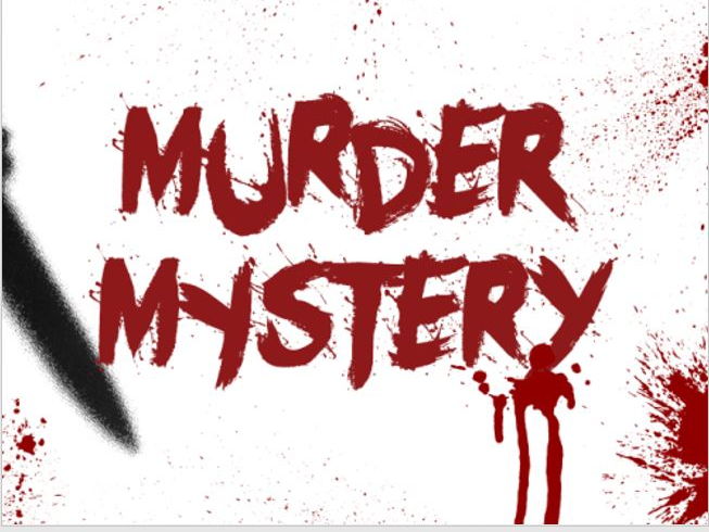
Heyy lovelies welcome back to my blog. Today we will be sketching some title designs for our opening sequence. Since our movie is in the horror genre, I wanted to stay true to the conventions of giving it an authentic feel. Based on our pitch, we decided that our title is going to be called “Murder Mystery”. With our main title (working title) , I want the majority of the fonts seen to be red. I also want to add a drippy effect to the letters, resembling blood in a way for that scary aspect. MURDER MYSTERY!
For the color, as I said I want the font to be about dark reddish color for our main title. For certain credits, like the directed by, etc. the color will be dark and bold for example AGM PRODUCTIONS. I also wanted to be creative and make some of the titles different sizes within one word, such as HoRrOR or hOrRoR. It all depends on the color of our background.
The size of the font is important so that the audience is able to read the credits clearly. Through our opening scene we want to be able to add credits in different places like the “knife” for example or the news report.
The titles will appear on screen like blinking lights. After a couple of seconds once it’s fully on the screen they will enlarge and fade away. Each one will fade in and out individually. When it comes to our main title, the words will drag down from the top of the screen into the middle leaving a trace of blood. I want to add this effect to put emphasis on the mur
der part. This will be our main title card, blood splattered in the background. Each credit will be shown for about 3 or 4 seconds until they disappear.
This concludes our title designs. I can’t wait to see it executed in our project. I’m really excited to see all the effects of the fonts come into play. Until next time lovelies. Stay tuned for more on our final task!!!


Comments
Post a Comment